How to retrieve users in Gutenberg
A few months ago I needed to create a small block in Gutenberg that made a query to get user data in WordPress. I was surprised by how little this section is documented so I decided to write a small tutorial showing how I managed to query users in Gutenberg.
To make things easier to digest, I will write a small block that simply allows you to select an author on the site and display their information. Let's start:
TABLE OF CONTENTS
- STEP 1: THE BLOCK BASE
- STEP 2: THE STRUCTURE
- STEP 3: SAVING THE SELECTION
- STEP 4: SHOWING THE USER INFORMATION
STEP 1: THE BLOCK BASE
We will start with the basic creation of the block, I will not delve too much into this topic because it is not the point of this tutorial, but to make things easier I will use the official WordPress tool @wordpress/create-block:
We simply need to execute these commands (slug is the name of the directory where the plugin will be created).
1npx @wordpress/create-block@latest mah-users --wp-env2cd mah-users3npx wp-env start4npm start5
Using wp-env
The wp-env flag allows us to create a local environment in which our plugin will work, if you already have an environment you use for testing this is not necessary.
If you are not very familiar with local environments, I invite you to watch my video (in spanish) Creating a local WordPress environment with WP-ENV on youtube where I explain a way to achieve it easily with the tools that WordPress offers.
Once we have our plugin working, we can start creating the block.
STEP 2: THE STRUCTURE
As I mentioned earlier, what we want to do is create a user selection, and that when selecting them the user data is displayed, so for this we will need only one attribute, which will be the ID of the user we want to display:
Then in our block.json we add the attribute:
1"attributes": {2 "userId": {3 "type": "number"4 }5}6
This tutorial is intended to be a dynamic block, so we will only show the block editor functionality. I will not delve into how a dynamic block is displayed in the frontend, but if you want me to do it leave a comment and I will see it in a future video.
STEP 2.1: THE SELECTION
As we need to select users, we can use one of the components that already exist in WordPress for this, so in the edit.js file we can import the SelectControl component and display it in the editor:
To import the component at the beginning of the file:
1import { SelectControl } from '@wordpress/components';2
And in the Edit function we return it:
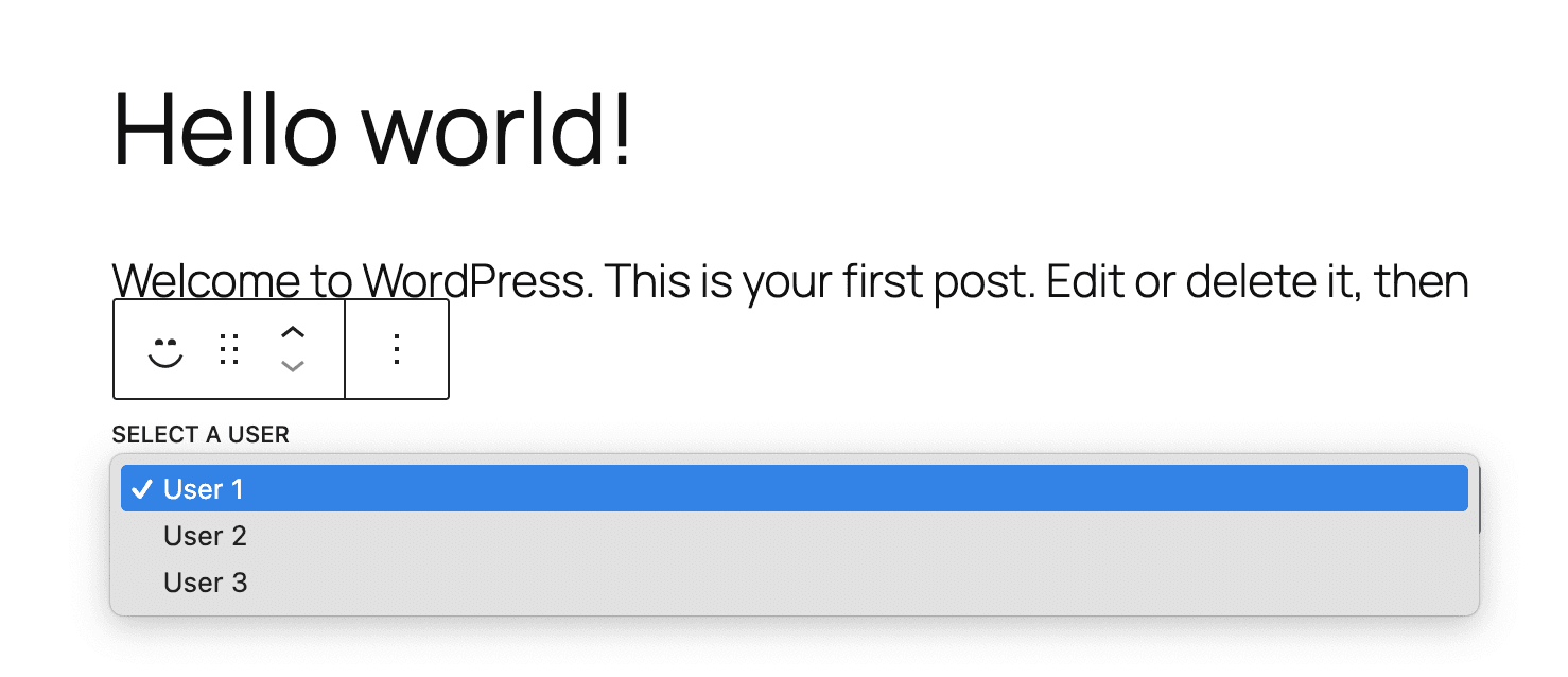
1export default function Edit() {2 return (3 <div { ...useBlockProps() }>4 <SelectControl5 label={ __( 'Select a user', 'mah-users' ) }6 value={ 'user1' }7 options={ [8 { label: 'User 1', value: 'user1' },9 { label: 'User 2', value: 'user2' },10 { label: 'User 3', value: 'user3' },11 ] }12 />13 </div>14 );15}16
If you are following this tutorial and wondering why the select is blue… It's because create-block adds some default styles to the files, to remove them simply delete the content of the style.scss and editor.scss files.
Once done, we will have something similar to this image:
STEP 2.2: THE REAL DATA
Our select box is working, but it's clear that it's not what we want, for starters, the data doesn't tell us anything, the first thing we should do is make a query to the database so that display the options based on the data that exists in our site.
Then, we can make use of the getUsers method that is available in the @wordpress/core-data package.
To start, we must import our components, go back to the beginning of the file and add the following:
1import { store as coreStore } from '@wordpress/core-data';2import { useSelect } from '@wordpress/data';3
And we make a select call to have our query, this is within the Edit function:
1const records = useSelect( ( select ) => {2 const { getUsers } = select( coreStore );34 return getUsers( {5 per_page: -1, // Select all users.6 _fields: 'id,name', // Only return the ID and the Name.7 context: 'view', // Indicates that we only want to view the data, not edit it. This reduces the fields to only what we need.8 } );9}, [] );10
When we use per_page: -1 we are telling WordPress that we want to query all the records. This can become problematic if we have for example a network of blogs with hundreds (or thousands) of users.
But generally, that is not the case so for the purposes of this tutorial we will assume it is safe to use it.
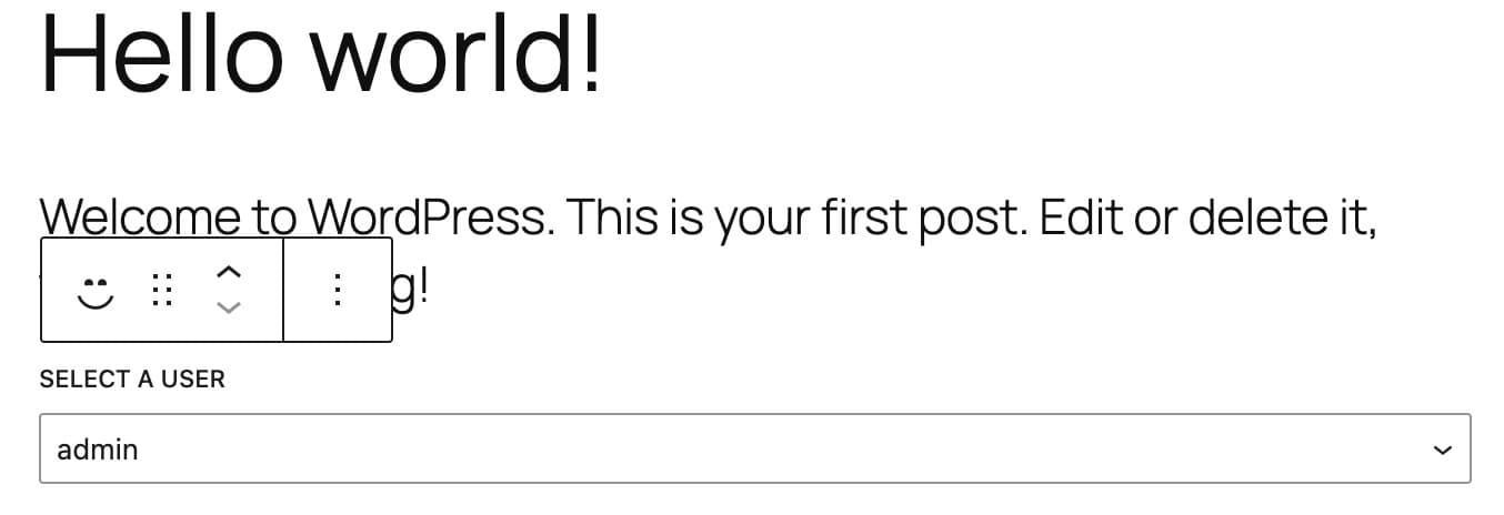
If we console.log with the content of records we will eventually have the following:
1[2 {3 "id": 1,4 "name": "admin"5 }6]7
This is almost what we need, why? because the format is incorrect, when we see the documentation of SelectControl we find that each option must be an object with a label and a value. In this case our value (what we are going to update in the block attributes) will be the user ID, while the label will be the user name.
So to get it we must make a small loop through the results, and since we are in this we will use useMemo to keep it in memory and not have to repeat it until we have new results.
First we import the function at the beginning of the file:
1import { useMemo } from '@wordpress/element';2
And right after our query, we convert the format to what we need:
1const records = useSelect( ( select ) => {2 const { getUsers } = select( coreStore );34 return getUsers( {5 per_page: -1, // Select all users.6 _fields: 'id,name', // Only return the ID and the Name.7 context: 'view', // Indicates that we only want to view the data, not edit it. This reduces the fields to only what we need.8 } );9}, [] );1011const users = useMemo( () => {12 const fetchedUsers = ( records ?? [ { id: '', name: __( 'Loading…', 'mah-users' ) } ] ).map( ( record ) => {13 return {14 value: record.id,15 label: record.name,16 };17 } );1819 return fetchedUsers;20}, [ records ] );21
If once again we try a console.log, what we will see is the format that we need, now simply replace the options we had in SelectControl with our users variable:
1[2 {3 "value": 1,4 "label": "admin"5 }6]7
1<SelectControl2 label={ __( 'Select a user', 'mah-users' ) }3 value={ 'user1' }4 options={ users }5/>6
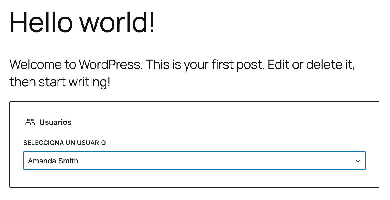
And the result will be the following:
If we want to have a better idea of how this would look with a real name, we only need to edit the user profile and add our data.
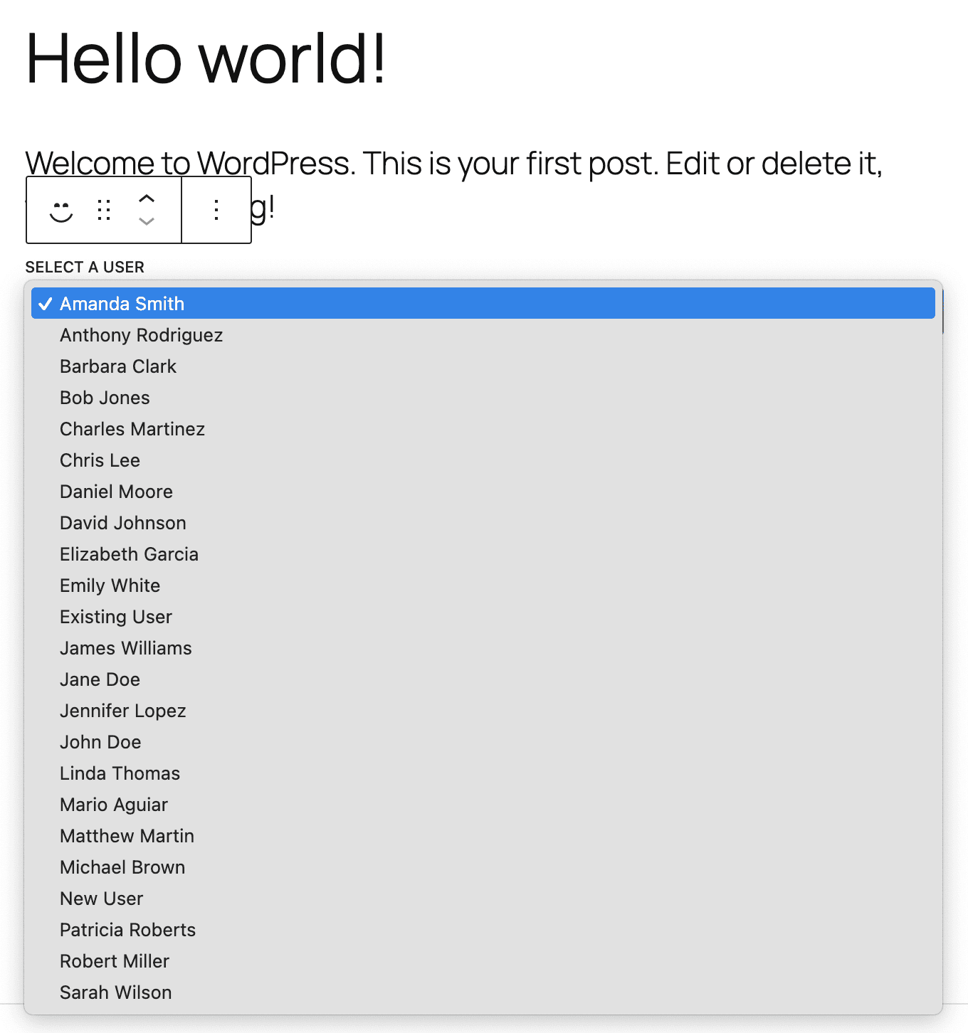
If we want to know how it would work with more users, there is a simple way to achieve it. wp-env comes with a version of wp-cli ready to use, and as mentioned in my Introduction to WP-CLI, there is a command that allows us to add new users easily. We need to create a CSV file with a list of users, for example users.cvs in the root of our mah-users folder:
1user_login,user_email,display_name,role2bobjones,bobjones@example.com,Bob Jones,contributor3newuser1,newuser1@example.com,New User,author4existinguser,existinguser@example.com,Existing User,administrator5johndoe,johndoe@example.com,John Doe,subscriber6janedoe,janedoe@example.com,Jane Doe,subscriber7
Now we save it and use the following command in the terminal:
1npx wp-env run cli wp user import-csv wp-content/plugins/mah-users/users.csv2
After adding some extra users to our site, now our result is the expected one:
STEP 3: SAVING THE SELECTION
Saving the selection is actually quite simple, as we already added the attribute in which we will save the selection at the beginning of this tutorial, we only need to add a function to the prop onChange of SelectControl (much buzzword…).
First we specify that we will use the props attributes, and setAttributes in the Edit function of our block:
1export default function Edit( { attributes, setAttributes } ) {2
Then we replace the value with the userId attribute and add a function to update the attribute when the value changes… something difficult to explain but basically it will look like this in code:
1<SelectControl2 label={ __( 'Select a user', 'mah-users' ) }3 value={ attributes.userId }4 options={ users }5 onChange={ ( userId ) => setAttributes( { userId: parseInt( userId, 10 ) } ) }6/>7
¿parseInt?
In the previous example I use parseInt to convert the new value to an integer, this because I started having problems with the value not being saved.
The reason was that it was trying to be saved as a string when in the attribute we specified that it was going to be a number.
Finally, we can try it by selecting a user from the dropdown, saving the post and if we reload the page, we should see the user we chose appear automatically selected.
STEP 4: SHOWING THE USER INFORMATION
Here we have a decision to make, on one hand, we could end our editor here (which would be completely acceptable) and advance to the frontend part, but as we care about the user experience, why not show a preview to the editor when we select a user?
The idea would be:
- Show the dropdown if no user has been selected
- Show a preview of the user data that is selected
- Offer controls to change the user from the preview
- Offer a way to delete the selection and go back to the dropdown
STEP 4.1: SHOWING THE DROPDOWN IF NO USER HAS BEEN SELECTED
The first step is almost done, we are already showing our dropdown by default, this, within Gutenberg, is what we know as "placeholder". In practice it shows when no selection has been made, and disappears when something is selected, but it doesn't work that way by default, so let's make it work:
To start, and to follow best practices, we will use the Placeholder component from Gutenberg from the same package where we imported SelectControl.
1import { SelectControl, Placeholder } from '@wordpress/components';2import { people } from '@wordpress/icons';3
Then, we specify that we want to show our dropdown only if no user has been selected, and we wrap it in the <Placeholder />.
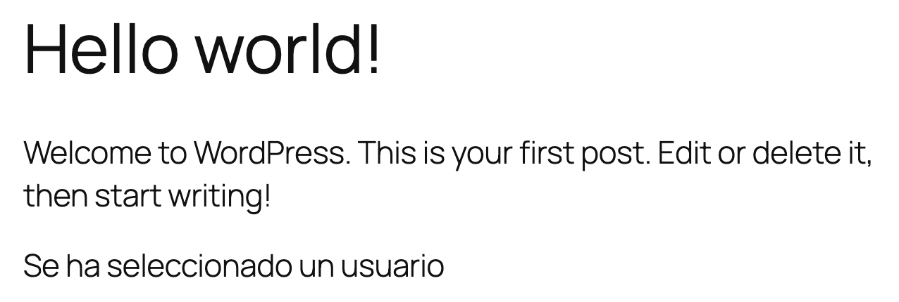
1if ( ! attributes.userId ) {2 return (3 <div { ...useBlockProps() }>4 <Placeholder icon={ people } label={ __( 'Usuarios', 'mah-users' ) }>5 <SelectControl6 label={ __( 'Select a user', 'mah-users' ) }7 value={ attributes.userId }8 options={ users }9 onChange={ ( userId ) => setAttributes( { userId: parseInt( userId, 10 ) } ) }10 />11 </Placeholder>12 </div>13 );14}1516return (17 <div { ...useBlockProps() } >18 { __( 'A user has been selected', 'mah-users' ) }19 </div>20);21
Now, if we reload the page we will see that since we have already selected and saved a user previously, we will have this result:
To see our placeholder, we only need to select the block, delete it, and insert a new one:
You will notice that we are importing an icon to show in our placeholder, if you want to know which ones are available you can give a tour of my Gutenberg Icon Finder.
STEP 4.2: SHOWING A PREVIEW OF THE SELECTED USER DATA
Now that we have different components to show, we must add a preview of the user data so that the editor knows what is being added, so to start, we must make a request to receive the data each time the user is selected.
For this we must add a new useSelect block that uses userId as a dependency, in this way we will be able to get the name of the user, their avatar, and their description.
1const { userName, userAvatar, userDescription } = useSelect( ( select ) => {2 const { getEntityRecord } = select( coreStore );3 const userInfo = getEntityRecord( 'root', 'user', attributes.userId );45 return {6 userName: userInfo?.name,7 userAvatar: userInfo?.avatar_urls?.['96'],8 userDescription: userInfo?.description,9 };10}, [ attributes.userId ] );11
And to show it we must replace our div that contains "A user has been selected" with a block with the data we just received:
If we don't want to get too involved in the design topic, Gutenberg offers a couple of components to help us layout, which I will use in the next example, these are Flex and FlexItem
We import the new components:
1import { Flex, FlexItem, SelectControl, Placeholder } from '@wordpress/components';2
And within the Edit function:
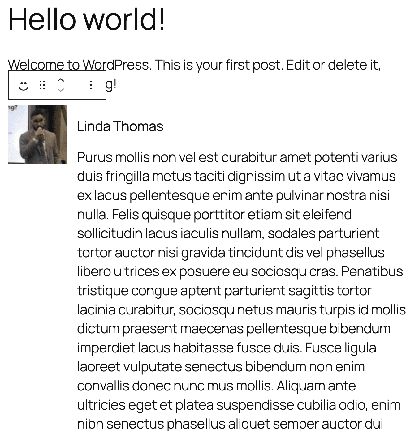
1return (2 <div { ...useBlockProps() } >3 <Flex justify='start' align='start' gap="4">4 <FlexItem>5 <img src={ userAvatar } alt={ userName } />6 </FlexItem>7 <FlexItem isBlock>8 <h3>{ userName }</h3>9 <p>{ userDescription }</p>10 </FlexItem>11 </Flex>12 </div>13);14
You will notice that the only thing we see is the name, so we must update the profile data with real information (remember that the avatar is linked to Gravatar), and once we save the data we will see this:
STEP 4.3: OFFERING CONTROLS TO CHANGE THE USER FROM THE PREVIEW
We have our preview, but we have a problem, and that is that if we want to change the user now, we will have to delete and recreate our block. That is not very friendly, so what we will do is add a control to our sidebar to easily change the user.
Basically we will copy our SelectControl and paste it in the controls, so for that we will import InspectorControls, and PanelBody and we will add them together with our block:
1import { InspectorControls } from '@wordpress/block-editor';2import { Flex, FlexItem, SelectControl, Placeholder, PanelBody} from '@wordpress/components';3
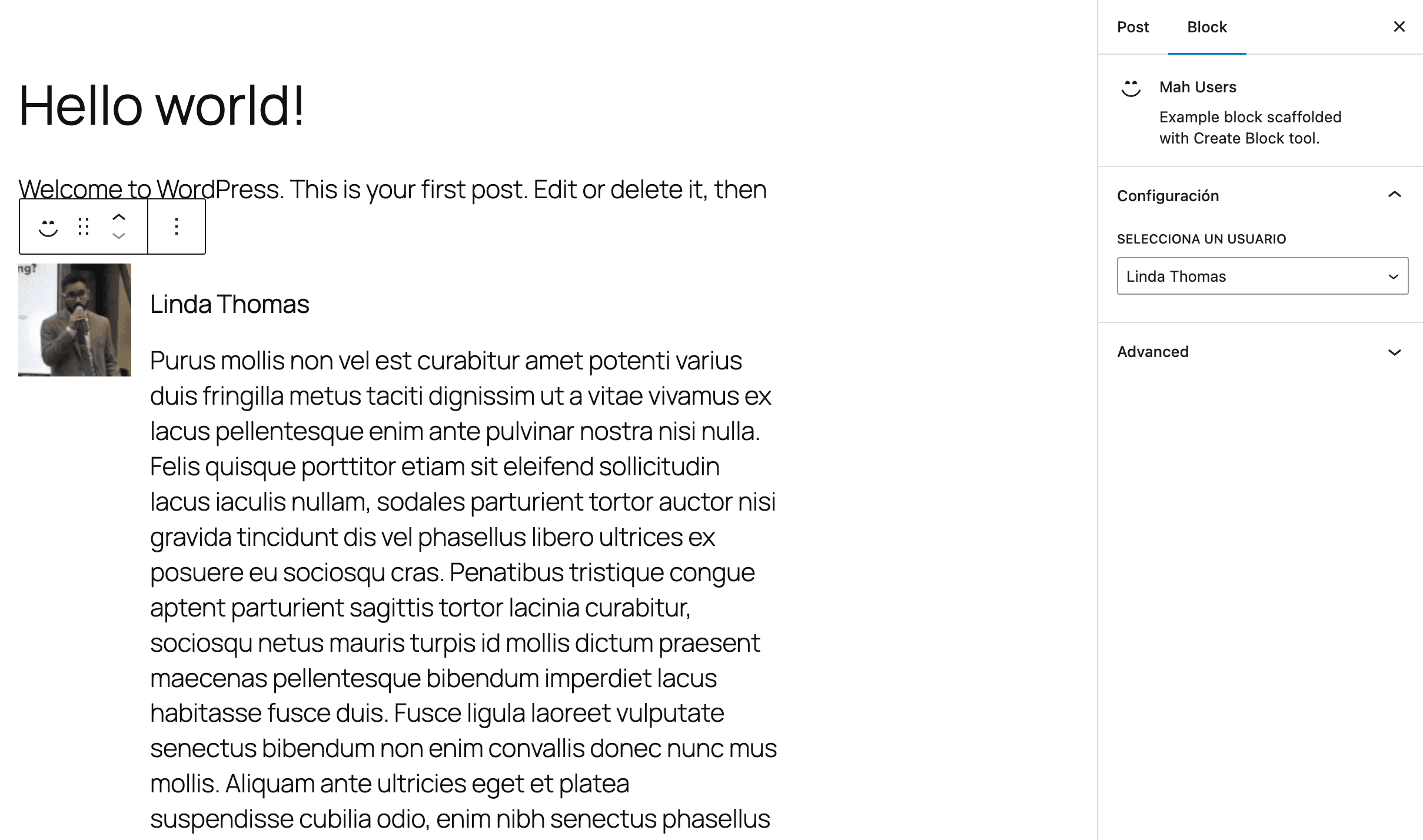
And just before our preview we add our control, so we modify the result in this way:
1return (2 <>3 <InspectorControls>4 <PanelBody title={ __( 'Configuración', 'mah-users' ) }>5 <SelectControl6 label={ __( 'Selecciona un usuario', 'mah-users' ) }7 value={ attributes.userId }8 options={ users }9 onChange={ ( userId ) => setAttributes( { userId: parseInt( userId, 10 ) } ) }10 />11 </PanelBody>12 </InspectorControls>1314 <div { ...useBlockProps() }>15 <Flex justify='start' align='start' gap="4">16 <FlexItem>17 <img src={ userAvatar } alt={ userName } />18 </FlexItem>19 <FlexItem isBlock>20 <h3>{ userName }</h3>21 <p>{ userDescription }</p>22 </FlexItem>23 </Flex>24 </div>25 </>26);27
And now we will see that we have the option to change the user without the need to delete our block:
In broad terms, InspectorControls is a portal that automatically places what we put inside it in the active sidebar for the block we are editing, this is useful because it allows us to place all the components of a block in the same place, instead of having to modify several related files.
STEP 4.4: OFFERING A WAY TO RESET THE SELECTION AND GO BACK TO THE DROPDOWN (OPTIONAL)
This last step is completely optional because we are already offering a way to change the user, but I wanted to show a way to reset the dropdown and be able to choose a user again.
The functional part is quite simple, all we have to do is assign a null value to the attribute, and for this we will add a button just next to our InspectorControls.
First we import the components:
1import { InspectorControls, BlockControls } from '@wordpress/block-editor';2import { Flex, FlexItem, SelectControl, Placeholder, PanelBody, ToolbarGroup, ToolbarButton } from '@wordpress/components';3
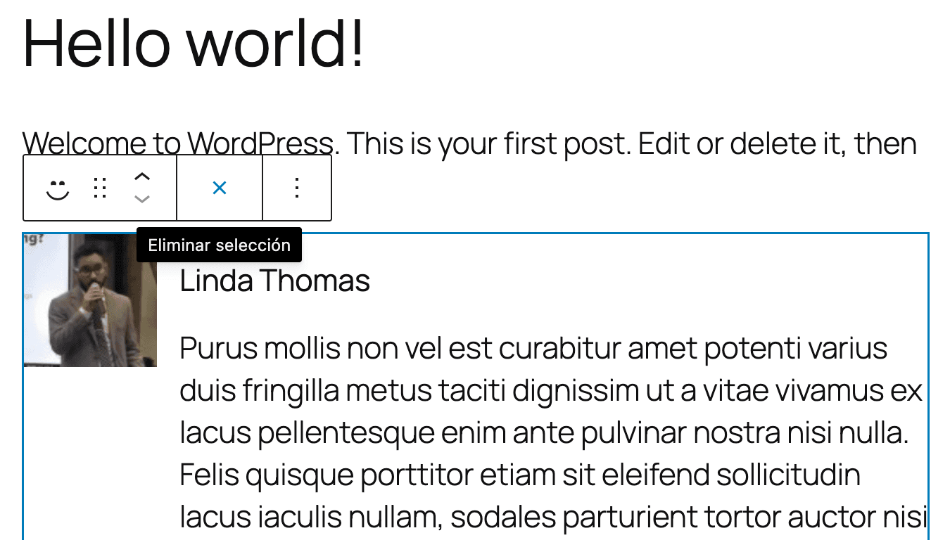
And simply we add the button that we imported inside the BlockControls component:
1<InspectorControls>2// …3</InspectorControls>45<BlockControls group="block">6 <ToolbarGroup>7 <ToolbarGroup>8 <ToolbarButton9 icon={ closeSmall }10 title={ __( 'Reset selection', 'mah-users' ) }11 onClick={ () => setAttributes( { userId: null } ) }12 />13 </ToolbarGroup>14 </ToolbarGroup>15</BlockControls>16
And with that, we will see a new button appear when we select the block, when we press it we will see how the selection is deleted and we return to the beginning:
Just like InspectorControls, BlockControls works as a portal.
CONCLUSION
That's all for this tutorial (which as usual went a bit longer than expected 😅️). The only thing we would have left to do would be to request the information in PHP when we show the block in the frontend.